Three directions
Each concept uses the same real content (projects, services, testimonials, accreditations) so you're comparing the look and feel, not the copy. Use the bar at the bottom, or press A, B or C, to switch between them.
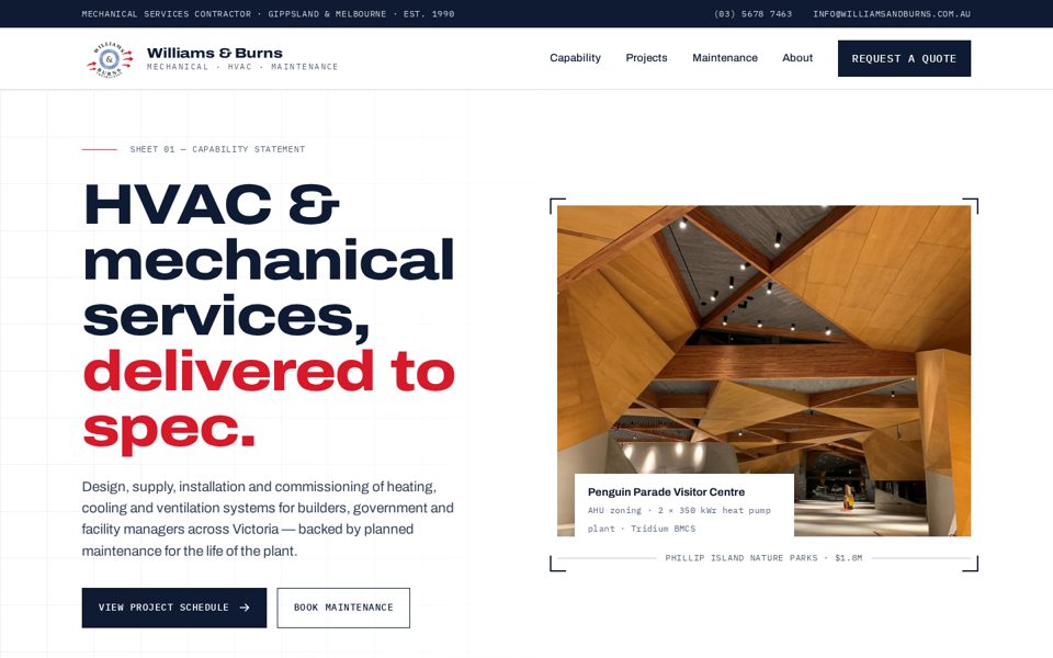
Schedule
Laid out like an engineering drawing sheet: hairline grids, title blocks, numbered scope of works and a filterable project schedule with values and builders. It speaks the language of tender assessors and builders.
- Type
- Archivo Expanded + IBM Plex Mono
- Palette
- Best for
- Tender credibility, capability statements
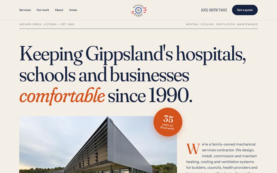
Gippsland Made
Warm and editorial, like a magazine: a soft serif, paper tones and hi-vis orange taken from the team's uniforms. It leads with the local, family-owned story, with a feature article on the Penguin Parade project.
- Type
- Fraunces + Instrument Sans
- Palette
- Best for
- Community trust, residential & local SEO
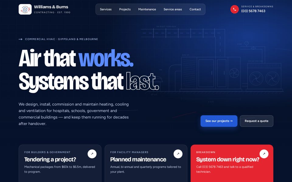
Airflow
Bold and modern, with animated airflow lines drawn from the logo's arrows. The hero sends visitors straight to one of three paths: tender, maintenance or breakdown. Below that are a services bento grid, a project carousel and maintenance plan cards.
- Type
- Bricolage Grotesque + Figtree
- Palette
- Best for
- Maintenance leads, service conversions
Shared across all concepts
- Clear paths for tender, maintenance, breakdown and residential enquiries
- Project values, builders and sectors to support tender submissions
- NEBB, ARC AU29571, Mitsubishi Diamond Dealer and the Kane MVP award
- Fully responsive, from desktop down to phone
Ready for local SEO
Each concept has a service-area section that links out to future location pages (e.g. /air-conditioning-wonthaggi/). Those pages can reuse the same layout, with nearby projects, local testimonials and LocalBusiness schema.
Notes
The logo is a vector redraw made from the 104px JPG, for concept use only, so a master vector file from the client is still needed. Photos come from the current site. Maintenance plan descriptions are suggestions and need confirming with the client.